Use the Plotly JavaScript library to create data visualizations (part 3 of 3)
In this third and final part of the Time Tracker tutorial, we will use the Plotly JavaScript library to visualize how we spend our time. You’ll get experience with the App Script HTML Service, learn how to leverage third-party libraries, and the discover the basics of how to use Plotly to create data visualizations.
If you haven’t already, complete Time Tracker - part 2 or jump in by copying the output of that tutorial here (please click the USE TEMPLATE button to make a copy into your own Google Drive).
step 1. create index HTML file
We’ll create a new HTML file in our script project to display the chart within a dialog box.
- In the left sidebar, click the plus icon to create a new file and select the option “HTML”. Name this file “index” (the final filename should be
index.html, Apps Script will automatically append.htmlfor you). - Apps Script will populate the HTML file with boilerplate. Let’s add the text “Hello, world” within the
<body>tag. Yourindex.htmlfile should contain:
<!DOCTYPE html>
<html>
  <head>
    <base target="_top">
  </head>
  <body>
    "Hello world"
  </body>
</html>
To launch this dialog box, we need to write a function and call the function from a menu item as we did in the previous tutorial.
- Open the file
Code.gs - Below the existing code, input the following function:
function openDialog() {
  var html = HtmlService.createTemplateFromFile('index').evaluate()
    .setWidth(800)
    .setHeight(600);
  SpreadsheetApp.getUi()
    .showModalDialog(html, 'Data Visualization');
}
You may need to adjust the width and height for your viewport.
- Update the
onOpenfunction with a new menu item:
function onOpen() {
  var ui = SpreadsheetApp.getUi();
  // Create a custom menu
  ui.createMenu('TRACKER')
    .addItem('Save Week', 'confirmAndLogData')
    .addItem('Clear Entries', 'confirmAndClearEntries')
    .addItem('Visualize Data', 'openDialog')
    .addToUi();
}
- Save the project (
Ctrl + S). - Navigate back to the Tracker Google Sheet and reload to view the new menu item.
- Launch the dialog box TRACKER > Visualize Data.
You may need to authorize Apps Script again, even if you did in part 2 of this tutorial series. Go ahead and re-authorize Apps Script and then repeat the last step to launch the dialog box. For more detail on authorization of Apps Script, see Time Tracker - part 2.
A dialog box should pop up with the phrase “Hello world”. It’s not much, but it’s a start!
step 2. load Plotly
We will now load the third-party library Plotly so that we can use it to visualize our data. Let’s use the Getting Started in JavaScript guide in Plotly’s documentation to get going.
- Open the file
index.html. - Replace the contents of the file with the below code:
<!DOCTYPE html>
<html>
  <head>
    <base target="_top">
    <script src="https://cdn.plot.ly/plotly-2.34.0.min.js" charset="utf-8"></script>
  </head>
  <body>
    <div id="tester" style="width:100;height:100;"></div>
    <script>
      TESTER = document.getElementById('tester');
      Plotly.newPlot( TESTER, [{
      x: [1, 2, 3, 4, 5],
      y: [1, 2, 4, 8, 16] }], {
      margin: { t: 0 } } );
    </script>
  </body>
</html>
- Save the project (
Ctrl + S).
Plotly offers a wealth of chart types and customization options. Read the documentation to learn about the options available. For my use case, I’d like to simply see the number of hours I spend each day by category over time. A stacked area chart would be a good choice for this data visualization.
From the stacked area chart documentation, we can see that we need data in the following format:
var traces = [
	{x: [1,2,3], y: [2,1,4], stackgroup: 'one'},
	{x: [1,2,3], y: [1,1,2], stackgroup: 'one'},
	{x: [1,2,3], y: [3,0,2], stackgroup: 'one'}
];
To read data from the spreadsheet and load it in the dialog box will require a basic understanding of how Apps Script interacts with the Google Sheet. The code in Code.gs is “server-side” and has access to the data in the spreadsheet. However, we want to display the data in the chart we declared in the index.html file, which is “client-side.” We’ll need to find a way to hand off the data between the client-side and server-side.
For this, Apps Script has what are called scriptlets. A scriptlet allows us to call a function written in the Code.gs file from the index.html file. Let’s try it.
step 3. read data from spreadsheet
- In
Code.gsadd the following function below the existing code:
function getData() {
  var ss = SpreadsheetApp.getActiveSpreadsheet();
  var dataSheet = ss.getSheetByName('all_data');
  var data = dataSheet.getDataRange().getValues();
  var headers = data.shift();

  console.log(data);

}
- Save the project (
Ctrl + S).
This function simply reads the data from the all_data sheet and prints it out. Let’s try it out to see what we get.
- In the Apps Script code editor’s top menu, select the function
getDatafrom the dropdown and click the Run button (see image below).

The Execution log should pop up in the bottom half of your screen and display something like what is shown below.
[ [ 'Writing',
    Mon Jan 01 2024 00:00:00 GMT-0700 (Mountain Standard Time),
    0.49999999999999956,
    'Draft article outline',
    'Areas' ],
  [ 'Client Project A',
    Mon Jan 01 2024 00:00:00 GMT-0700 (Mountain Standard Time),
    1.5,
    'Deliverable 1b',
    'Work' ], ...
]
Our next task will be to format this output to match what Plotly expects for a stacked area chart. To pass data from the server-side to the client-side, we typically need to convert it to the JavaScript Object Notation (JSON) format. Luckily, this is also the format that Plotly expects for the traces variable.
step 4. format data as JSON
Let’s get the data array formatted as JSON. This code is a bit complex, but we’ll break it down so that we can see how it works.
- Update the function
getDatato:
function getData() {
  var ss = SpreadsheetApp.getActiveSpreadsheet();
  var dataSheet = ss.getSheetByName('all_data');
  var data = dataSheet.getDataRange().getValues();
  var headers = data.shift();

  // Step 1: Group by date and category
  const groupedData = data.reduce((acc, [_, date, hours, __, category]) => {
    const dateString = date.toDateString();
    const key = `${dateString}_${category}`;

    if (!acc[key]) {
      acc[key] = { date: dateString, category: category, totalHours: 0 };
    }
    acc[key].totalHours += hours;

    return acc;
  }, {});

  // Step 2: Transform grouped data into an array
  const result = Object.values(groupedData);

  console.log(result);
}
This code uses the reduce() method to sum the hours for each category by date. The date is first converted to a date string (working with dates in JavaScript can be a challenge!). A key is created for each data and category pair. Then the hours are summed and the result is converted back to an array. The output should look like this:
[ { date: 'Mon Jan 01 2024',
    category: 'Areas',
    totalHours: 2.5000000000000004 },
  { date: 'Mon Jan 01 2024',
    category: 'Work',
    totalHours: 3.0000000000000013 }, ...
]
Next, we’ll reformat this to the specific format needed by Plotly, as we saw previously. We’ll add a key name to each entry with the category so that the traces are labeled correctly in our chart.
- Update the
getDatafunction to:
function getData() {
  var ss = SpreadsheetApp.getActiveSpreadsheet();
  var dataSheet = ss.getSheetByName('all_data');
  var data = dataSheet.getDataRange().getValues();
  var headers = data.shift();

  // Step 1: Group by date and category
  const groupedData = data.reduce((acc, [_, date, hours, __, category]) => {
    const dateString = date.toDateString(); // Convert date to a string for grouping
    const key = `${dateString}_${category}`; // Create a unique key based on date and category

    if (!acc[key]) {
      acc[key] = { date: dateString, category: category, totalHours: 0 };
    }
    acc[key].totalHours += hours;

    return acc;
  }, {});

  // Step 2: Transform grouped data into an array
  const result = Object.values(groupedData);

  // Step 3: Extract unique dates and categories
  const uniqueDates = [...new Set(result.map(item => item.date))];
  const uniqueCategories = [...new Set(result.map(item => item.category))];

  // Step 4: Initialize traces for each category
  const traces = uniqueCategories.reduce((acc, category) => {
    acc[category] = {
      x: uniqueDates,
      y: Array(uniqueDates.length).fill(0),
      stackgroup: 'one',
      name: category
    };
    return acc;
  }, {});

  // Step 5: Populate traces with total hours
  result.forEach(({ date, category, totalHours }) => {
    const dateIndex = uniqueDates.indexOf(date);
    traces[category].y[dateIndex] += totalHours;
  });

  // Step 6: Convert the trace data to an array format
  const plotlyTraces = Object.values(traces);

  console.log(plotlyTraces);

  // Output the plotlyTraces
  return plotlyTraces;

}
The output should be exactly what Plotly needs to make our chart. It should look like this:
[ { x:
     [ 'Mon Jan 01 2024',
       'Tue Jan 02 2024',
       'Wed Jan 03 2024',
       'Thu Jan 04 2024',
       'Fri Jan 05 2024',
       'Sat Jan 06 2024',
       'Sun Jan 07 2024' ],
    y:
     [ 2.5000000000000004,
       2.5000000000000004,
       2.5000000000000004,
       2.5000000000000004,
       2.5000000000000004,
       2.5000000000000004,
       2.5000000000000004 ],
    stackgroup: 'one',
    name: 'Areas' }, ...
]
Now that we have the data aggregated and in the right format, how do we get it to show up in the dialog box? We’ll tackle that in the next step.
step 5. pass the data to the client
- In the
Code.gsfile, update the functionopenDialogto:
function openDialog() {
  var html = HtmlService.createTemplateFromFile('index');
  html.plotlyTraces = JSON.stringify(getData());
  html = html.evaluate()
    .setWidth(800)
    .setHeight(600);
  SpreadsheetApp.getUi()
      .showModalDialog(html, 'Hours per day');
}
We’ve pushed a variable called plotlyTraces to the HTML template by assigning it as a property of the HTMLTemplate object. The variable plotlyTraces is the output of the function we wrote in the previous step. Before we pass it on to the client, we “stringify” it into a string (sequence of characters) with `JSON.stringify().
Next, we’ll read the JSON object into the index.html file so we can display it in the chart.
step 6. read the data into the chart
- Update the contents of the
<script>tag in the fileindex.htmlto be:
<script>
	TESTER = document.getElementById('tester');
	let traces = JSON.parse(<?= plotlyTraces ?>);
	Plotly.newPlot(TESTER, traces);
</script>
Here, we’ve simply replaced the variable traces from the boilerplate provided by Plotly to the data from our spreadsheet. We’ve parsed it from the string back to a proper JSON object with JSON.parse(). The funny <?= ?> syntax is the Apps Script scriptlet syntax, which you can learn more about on the Apps Script documentation.
- Save the project (
Ctrl + S).
That’s it! Return to the Tracker spreadsheet and open the data visualization from the custom menu (TRACKER > Visualize Data). The dialog box will show a chart with your data, like this:
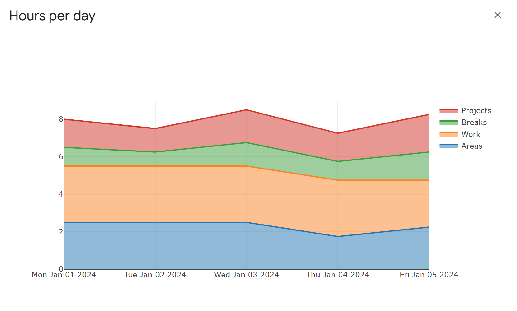
In this tutorial, you’ve written some HTML, passed data between the server-side and client-side using JSON, and created a chart using the third-party JavaScript library Plotly.
Congratulations on completing the full tutorial! This is just the beginning. Plotly offers many customizations and chart types. You’ll notice that the charts are interactive. You can drag the axes, zoom in and out, and click the legend items to turn traces on and off. Read the docs and play around with the Plotly charting library to see what else you can do.
bonus: auto-increment date
In part 2 of this tutorial series, I challenged you to auto-increment the date to today’s date when logging the entries. I’ve provided the code below.
function increment_date() {
  var ss = SpreadsheetApp.getActiveSpreadsheet();
  var trackerSheet = ss.getSheetByName('Tracker');
  var today = new Date();
  trackerSheet.getRange("A1").setValue(today);
}
This code simply writes today’s date in cell A1 of the Tracker sheet when you log the previous week’s entries.